Most Dashboards Stop at “What Happened.” Real Analytics Should Tell You What to Do Next
Most dashboards are designed to show us what happened.
Revenue dropped.
Sales slowed down.
Leads decreased.
Customer complaints increased.
Performance changed.
That kind of information matters.
But here is the problem:
A dashboard that only tells you what happened is usually just a digital report.
It may look modern.
It may have charts, filters, colors, and interactive visuals.
It may even impress people during a presentation.
But if it does not help people understand the situation, make decisions, and take action, then it is not yet a true analytics tool.
It is only showing the past.
Real analytics should do more than describe performance.
Real analytics should help answer:
- What happened?
- Why did it happen?
- So what?
- Now what?
- What’s next?
That is where dashboards become powerful.
Because great data work is not just about charts.
It is about clarity.
It is about helping leaders move from observation to understanding, from understanding to action, and from action to measurable impact.
The Problem With Many Dashboards Today
Many organizations have dashboards, but not all organizations are truly data-driven.
This is a hard truth.
Having dashboards does not automatically mean a company is making better decisions.
A company can have dozens of dashboards and still struggle with slow decisions, unclear priorities, repeated issues, and misaligned teams.
Why?
Because many dashboards are built as reporting tools, not decision-making tools.
They answer questions like:
- How much did we sell?
- How many leads did we generate?
- What was the conversion rate?
- How many tickets were resolved?
- What was the monthly revenue?
- Which region performed best?
These are useful questions.
But they are only the starting point.
The deeper business questions are usually:
- Why did this number change?
- What caused the decline?
- Which segment contributed most to the issue?
- How big is the business impact?
- What should we prioritize?
- What action will create the biggest improvement?
- What will happen if we do nothing?
- What should we expect next month?
This is where many dashboards fail.
They show data, but they do not guide thinking.
They present information, but they do not create direction.
They describe the situation, but they do not support decision-making.
A dashboard should not leave leaders asking, “Okay, so what do we do now?”
A strong dashboard should bring them closer to the answer.
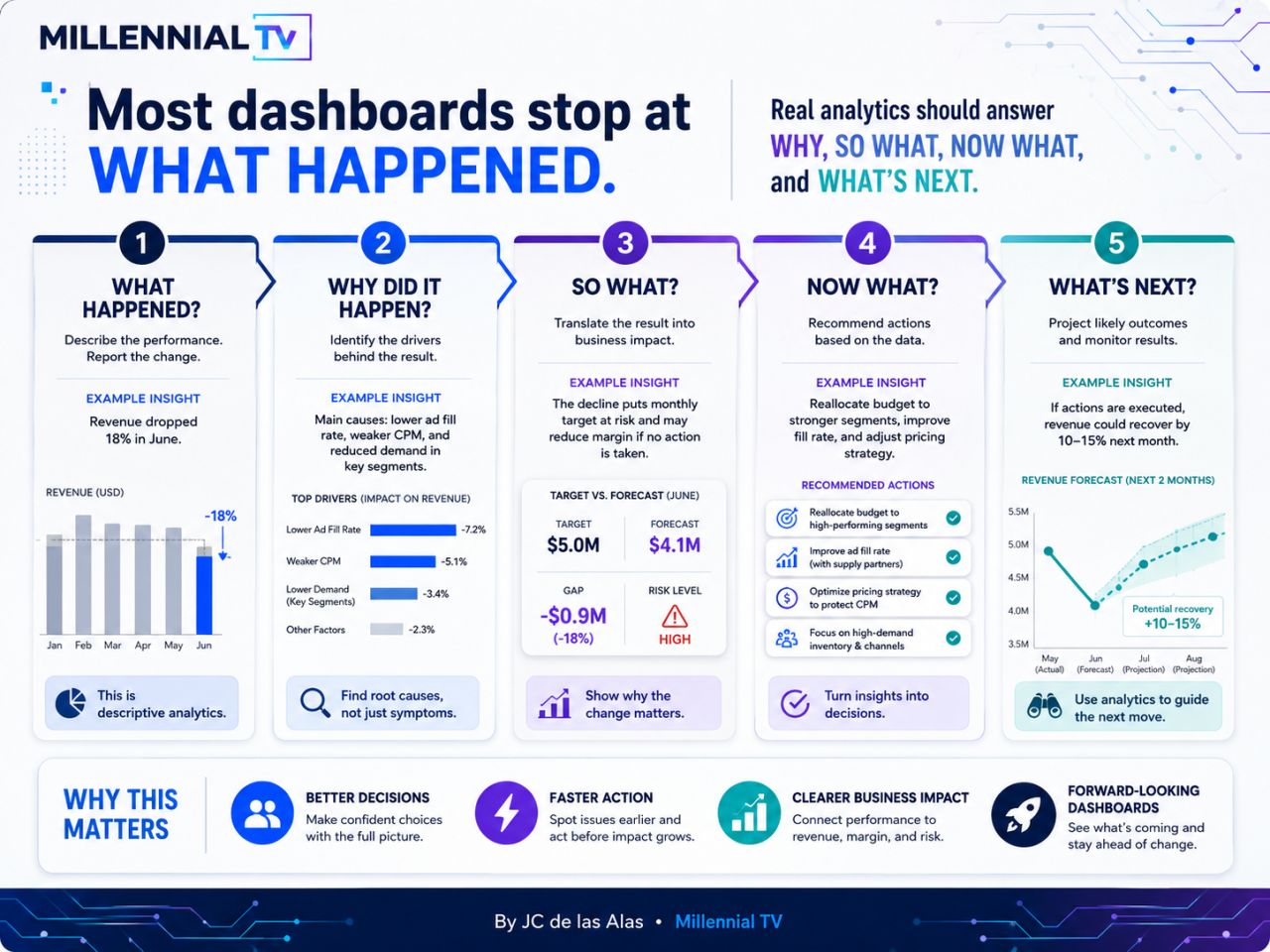
1. What Happened?
The first role of a dashboard is to describe performance.
This is the descriptive layer of analytics.
It answers the question:
What changed?
For example:
- Revenue dropped by 18% in June.
- Website traffic decreased by 12%.
- Customer churn increased by 5%.
- Sales conversion fell from 8% to 6%.
- Operating cost increased by 10%.
This layer is important because it creates visibility.
Without this layer, leaders are blind.
They cannot manage what they cannot see.
But visibility alone is not enough.
Knowing that revenue dropped is useful, but it does not tell us why revenue dropped. It also does not tell us whether the issue is urgent, where to focus, or what action to take.
This is why dashboards that stop at “what happened” often create more questions than answers.
They give people data, but not enough context.
A good dashboard should clearly show:
- The metric that changed
- The size of the change
- The time period affected
- The trend before and after the change
- Whether the result is good, bad, or concerning
- How it compares to a target, benchmark, or historical average
For example, instead of saying:
Revenue dropped in June.
A stronger dashboard insight would say:
Revenue dropped by 18% in June compared to May, falling below the monthly target by $0.9M.
That is already better because it gives context.
But it still does not fully answer the bigger business question.
It tells us what happened.
Now we need to understand why.
2. Why Did It Happen?
The second layer of analytics is diagnosis.
This answers the question:
What caused the result?
This is where dashboards become more useful.
A weak dashboard shows that performance declined.
A stronger dashboard helps identify the drivers behind the decline.
For example, if revenue dropped by 18%, possible causes may include:
- Lower lead volume
- Lower conversion rate
- Weaker customer demand
- Reduced marketing spend
- Pricing changes
- Sales team capacity issues
- Product availability problems
- Delayed orders
- Poor campaign performance
- Higher cancellation or churn rate
Without identifying the drivers, teams may act on assumptions.
And assumptions are dangerous in business.
For example, if sales decreased, one team might blame marketing for weak leads. Marketing might blame sales for poor follow-up. Sales might blame product availability. Finance might blame pricing. Leadership might blame the market.
But without proper analysis, everyone may be guessing.
A good dashboard reduces guessing.
It helps teams see which factors contributed most to the result.
For example:
Revenue declined by 18% in June. The largest drivers were a 7.2% impact from lower ad fill rate, a 5.1% impact from weaker cost per mille performance, and a 3.4% impact from lower demand in key customer segments.
Now the conversation changes.
Instead of saying:
Revenue is down. What happened?
The team can say:
Revenue is down, and the biggest drivers appear to be ad fill rate, pricing performance, and weaker demand from specific segments.
That is a much better starting point.
The goal is not just to report symptoms.
The goal is to identify root causes.
3. So What?
This is the part many dashboards miss.
After explaining what happened and why it happened, the next question should be:
So what does this mean for the business?
This is the business impact layer.
A dashboard may show a decline, but leaders need to know whether that decline is minor, serious, urgent, or strategic.
For example:
- Is the revenue drop large enough to affect the monthly target?
- Is the decline isolated to one product, or is it happening across the business?
- Is this a temporary dip or an early warning sign?
- Does this affect profitability?
- Does this affect customer retention?
- Does this create operational risk?
- Does this require leadership action?
This is where analytics must translate numbers into meaning.
For example, this is weak:
Revenue dropped by 18%.
This is better:
Revenue dropped by 18%, creating a $0.9M gap against the monthly target and putting the team at high risk of missing the quarter-end forecast.
That statement is more valuable because it connects the metric to business impact.
It tells leaders why the number matters.
This is one of the biggest differences between reporting and analytics.
Reporting says:
Here is the number.
Analytics says:
Here is what the number means.
A dashboard should help people understand the consequence of the change.
Because not every metric movement deserves the same level of attention.
Some changes are noise.
Some changes are early signals.
Some changes are business-critical.
The job of analytics is to help people know the difference.
4. Now What?
Once we understand what happened, why it happened, and why it matters, the next question is:
What should we do next?
This is the recommendation layer.
This is also where dashboards become decision-making tools.
Many dashboards stop before this point because teams are afraid to recommend actions. They think dashboards should only present data, not suggest decisions.
But that mindset limits the value of analytics.
A good dashboard does not need to make the decision for the leader.
But it should help narrow the options.
It should make the next best actions clearer.
For example, if the data shows that revenue declined because of lower ad fill rate, weaker pricing performance, and lower demand in specific segments, then the dashboard can recommend actions such as:
- Reallocate budget to higher-performing segments
- Improve ad fill rate with supply partners
- Review pricing strategy to protect margins
- Focus on high-demand inventory and channels
- Investigate underperforming customer segments
- Launch retention campaigns for at-risk accounts
- Run controlled experiments to test recovery actions
The point is not to overload the dashboard with generic advice.
The point is to connect recommendations to the data.
Bad recommendation:
Improve performance.
Better recommendation:
Reallocate budget from low-performing segments to segments with stronger conversion and higher revenue contribution.
Bad recommendation:
Increase sales.
Better recommendation:
Prioritize follow-up on leads from the highest-converting channels and pause spend on campaigns with declining return.
The recommendation must be specific enough to guide action.
This is where analytics creates speed.
Without recommendations, teams may spend hours debating what to do.
With clear insights, they can move faster.
A strong dashboard should help leaders answer:
- What should we prioritize?
- What action has the highest potential impact?
- What decision needs to be made now?
- Who should act on this?
- What should be monitored after the action?
This is where dashboards move from passive reporting to active decision support.
5. What’s Next?
The final layer is forward-looking analytics.
This answers the question:
What is likely to happen next?
This is where forecasting, scenario planning, and artificial intelligence become valuable.
A dashboard should not only help us understand the past. It should also help us prepare for the future.
For example:
- If current trends continue, will revenue recover or decline further?
- What is the expected sales forecast for next month?
- Which customers are at risk of churn?
- Which products are likely to experience demand changes?
- What happens if we increase budget by 10%?
- What happens if we do nothing?
- What is the best-case, expected-case, and worst-case scenario?
This does not mean every dashboard needs advanced machine learning.
Sometimes, simple forecasting and trend analysis are already enough.
But the mindset matters.
The goal is to help the business stay ahead.
For example:
If recommended actions are executed, revenue could recover by 10–15% next month based on current forecast patterns.
That kind of insight is more useful than simply showing that revenue declined last month.
It gives leaders a view of possible outcomes.
It helps the business prepare.
It makes analytics forward-looking.
And in the age of artificial intelligence, this will become even more important.
Organizations will not only ask:
What happened last month?
They will increasingly ask:
What is likely to happen next, and what should we do about it?
That is the future of analytics.
A Simple Framework for Better Dashboards
If you want to build better dashboards, use this five-question framework:
| Question | Purpose | Example |
|---|---|---|
| What happened? | Describe performance | Revenue dropped by 18% in June. |
| Why did it happen? | Identify root causes | The decline was driven by lower ad fill rate, weaker pricing performance, and reduced demand. |
| So what? | Explain business impact | The decline created a $0.9M gap versus target and increased the risk of missing the monthly goal. |
| Now what? | Recommend action | Reallocate budget to high-performing segments and improve fill rate with supply partners. |
| What’s next? | Forecast outcomes | If actions are executed, revenue may recover by 10–15% next month. |
This framework forces the dashboard to move beyond reporting.
It pushes the team to connect data with decisions.
And that is where the real value of analytics begins.
Why Beautiful Dashboards Are Not Enough
Design matters.
A clean dashboard is easier to understand.
A well-structured visual can reduce confusion.
Good colors, spacing, labels, and layout can help users focus on what matters.
But design alone does not create business value.
A beautiful dashboard with weak insight is still weak.
A dashboard can look premium and still fail to answer the most important questions.
This is one of the biggest traps in business intelligence.
Teams sometimes spend too much time making dashboards look impressive, but not enough time making them useful.
A dashboard should not be judged only by how it looks.
It should be judged by the quality of decisions it supports.
Ask these questions:
- Did the dashboard make the situation clearer?
- Did it help identify the cause of the issue?
- Did it show the business impact?
- Did it guide the next action?
- Did it help the team monitor the result after action was taken?
- Did it reduce unnecessary meetings or confusion?
- Did it help leaders decide faster?
If the answer is no, then the dashboard may need more than a design improvement.
It may need a better analytics strategy.
The Real Goal of Analytics
The goal of analytics is not to impress people with visuals.
The goal is to help people make better decisions.
A dashboard should help a business:
- See the truth
- Understand the cause
- Measure the impact
- Decide what to do
- Act with confidence
- Monitor the result
- Prepare for what may happen next
That is the difference between data reporting and data leadership.
Reporting looks backward.
Analytics connects the past, present, and future.
Reporting shows the numbers.
Analytics explains what the numbers mean.
Reporting creates visibility.
Analytics creates clarity.
Reporting supports discussion.
Analytics supports decisions.
From Data to Decisions, Decisions to Action, Action to Impact
The best organizations do not win because they have the most dashboards.
They win because they know how to use data properly.
They turn data into decisions.
They turn decisions into action.
They turn action into measurable impact.
That is the real value chain of analytics.
Data alone is not enough.
Dashboards alone are not enough.
Artificial intelligence alone is not enough.
The advantage comes from combining data, business context, good judgment, and execution.
This is why analysts, data leaders, and business intelligence teams must think beyond charts.
They must learn how to translate technical findings into business language.
They must understand what leaders actually need to decide.
They must design dashboards that are not only informative, but actionable.
Because in real business situations, the question is rarely just:
What happened?
The better question is:
What should we do next?
Final Thought
Most dashboards are designed to show what happened.
But real analytics should help us understand why it happened, what it means, what to do next, and what could happen in the future.
A beautiful dashboard may get attention.
But an insightful dashboard can change the direction of a business.
So the next time you build or review a dashboard, ask yourself:
Does this only explain the past, or does it help us build the future?
Because in the age of data and artificial intelligence, the winners will not be the ones with the most reports.
The winners will be the ones who can turn data into decisions, decisions into action, and action into measurable impact.
Data should not just tell us what happened.
Data should help us decide what happens next.
By JC de las Alas | Millennial TV